SWS NAP Chart Construction
Network to Area Prediction (NAP)
A NAP is an extension of a Hourly Area Predicton. An Hourly Area Prediction consists of a single base and a communication area. A NAP chart allows for the use of more than one base to be included in the prediction area. For a mobile at an arbitrary location within the area of coverage, communication with a number of these bases may be possible. The base selected for communication with the mobile is the HF circuit with the highest optimum working frequency (OWF). The highest OWF is selected as this is furthest from the absorption limiting frequency (ALF), and thus should give the best HF communications quality. Note that this means the base the mobile is communicating with will probably not be the nearest, and that all base stations in the NAP must be operational for the NAP to be usable (as the OWF is used to pick the base station contacted).
How to Use a NAP Chart
NAP charts are "read" in a similar way to HAP charts, ie locate the mobile,and look up the frequency from the colour of the contour. Remember you do not know which base is being used for the contact. A Nap chart is shown below, its appearance is very similar to a HAP chart.

Note: If any base ceases to function the NAP chart should not be used
Example:
A mobile is located at 20S 150 E (near Townsville) the frequency use to contact this mobile is determined by looking at the colour at this location (dark green) and then looking up the frequency from the frequency legend by matching the colour. In this case 13.3Mhz.
NAP Construction from HAPs
A NAP is constructed from a number of HAPs, (a HAP chart for each base station in the network). A HAP chart is a base to area prediction, consisting of an array of grid points within the area. Each point is an HF circuit between the base and the gridpoint, and has an associated OWF and ALF. The HAPs used must cover the same area, and have the same number of grid points (latitude step, longitude step) as each HAP grid point has to be compared to produce the NAP. The NAP is produced by comparing the OWFs at each corresponding grid point in each HAP, and choosing the highest OWF. The ALF is chosen in a similar way but selecting the lowest ALF from the contributing HAPs at each gridpoint. This gives the "HF bandwidth" at each gridpoint for the network to area prediction. This resultant array of OWFs and ALFs is then used with the customers frequency set to produce the NAP.
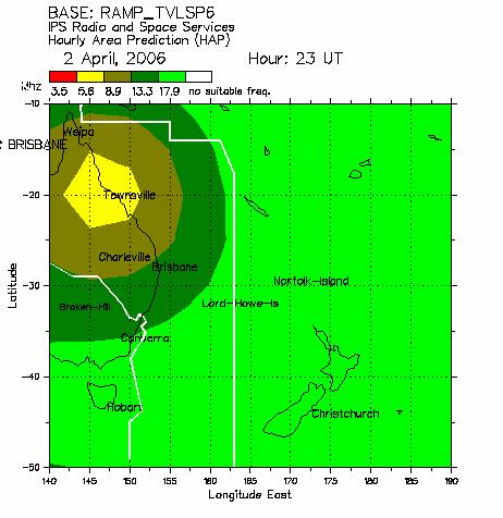
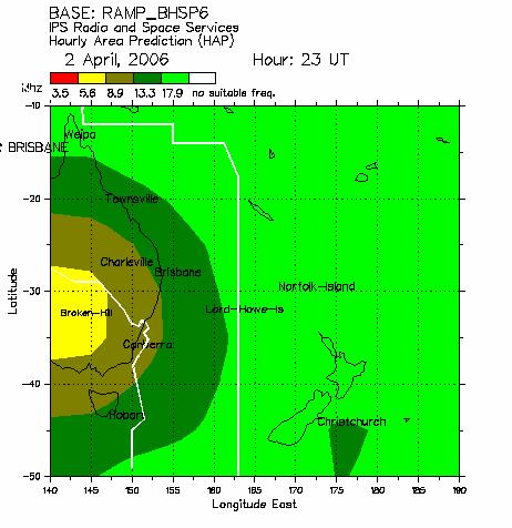
Example: Two base stations in network: Townsville and Broken Hill
Townsville HAP:

Note: For each point in the contributing HAP charts choose the highest OWF and the lowest ALF.
Particular Location Construction Example:
For location 35S 145E, on 2 April 2006 at 23UT, the following data could be extracted from the Broken Hill and Townsville HAP charts:
| Base | OWF |
|---|---|
| Broken Hill | 5.6Mhz |
| Townsville | 13.3Mhz |
Applying the above rule for NAP production gives 13.3Mhz for network communication at this location. This is done for each gridpoint in the contributing HAPs. The resultant NAP chart is shown in the "How to Use a NAP Chart" section at the top of this document.


